Has the curve flattened?
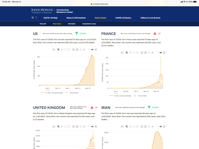
Countries around the world are working to “flatten the curve” of the coronavirus pandemic. Flattening the curve involves reducing the number of new COVID-19 cases from one day to the next. This helps prevent healthcare systems from becoming overwhelmed. When a country has fewer new COVID-19 cases emerging today than it did on a previous day, that’s a sign that the country is flattening the curve.
On a trend line of total cases, a flattened curve looks how it sounds: flat. On the charts on this page, which show new cases per day, a flattened curve will show a downward trend in the number of daily new cases.
This analysis uses a 5-day moving average to visualize the number of new COVID-19 cases and calculate the rate of change. This is calculated for each day by averaging the values of that day, the two days before, and the two next days. This approach helps prevent major events (such as a change in reporting methods) from skewing the data. The interactive charts below show the daily number of new cases for the 10 most affected countries, based on the reported number of deaths by COVID-19…
To read the entire article from John Hopkins University of Medicine, click https://coronavirus.jhu.edu/data/new-cases


